The 18-24 year old demographic does not remember 9/11 very well. As a visual and vocal generation they yearn to be taught in this manner, and there are not a lot of websites that teach this subject in this manner. The goal was to create a responsive streamlined website for three platforms: tablet, mobile, and desktop focusing on the oral and visual history surrounding this event.
The design is rich and immersive both visually and orally, giving a detailed and comprehensive history. It also serves as a progressive time line, with detailed accounts at each different event. It teaches not only about the events that day but the lasting impact on this and the previous generation.
Please note this design is not coded/created with markup language, this mockup was made in UX Pin.
This memoir focused on the trials and tribulations of addiction. The interior flaps feature excerpts from the book. The cover needed to focus on those struggles with a singular cover image designed to not only be engaging, but draw the reader in a meaningful way.
An image of a blurry cigarette in hand was designed along with a black cover and staggered title layout to further push the theme of addiction and chaos. The typesetting was designed to honor the content and create an overall identity in the book. The content was organized to take the reader on a journey, the cover serving as the gateway.
This is an unpublished mockup made for an outside author.
The Dunwich Horror is part of the Cthulo mythos crafted by H.P. Lovecraft. Cthulo is an integral part of this work that is often inappropriately reflected. The rise of Cthulo is one of the most significant climaxes in the book. The goal was to illustrate an image that was simple and reflected the overall feel of the book.
A cover was created with two of Ctuhlo’s tentacles rising up and surrounding the symbol of the Necronomicon. The style of inking and cross hatching was used to resemble etching and reflect the time period of the overall book. The typesetting honors the content of the book, designed to respect the words within and give a feeling of uneasiness that permeates through the story.
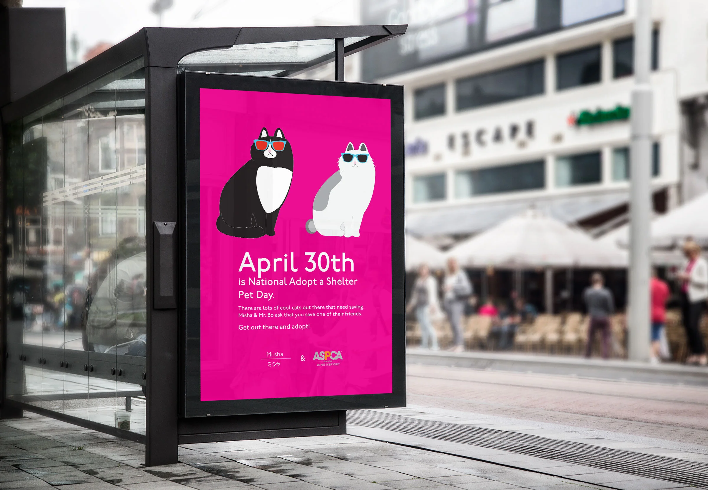
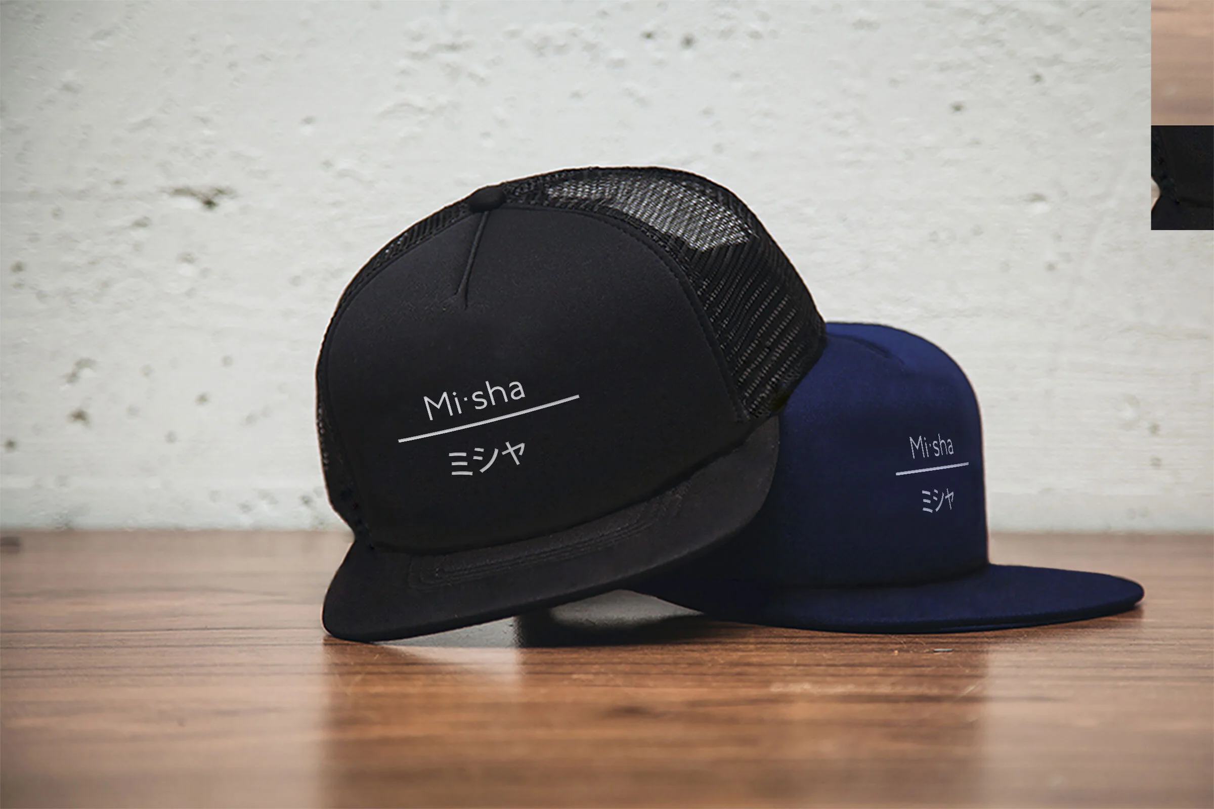
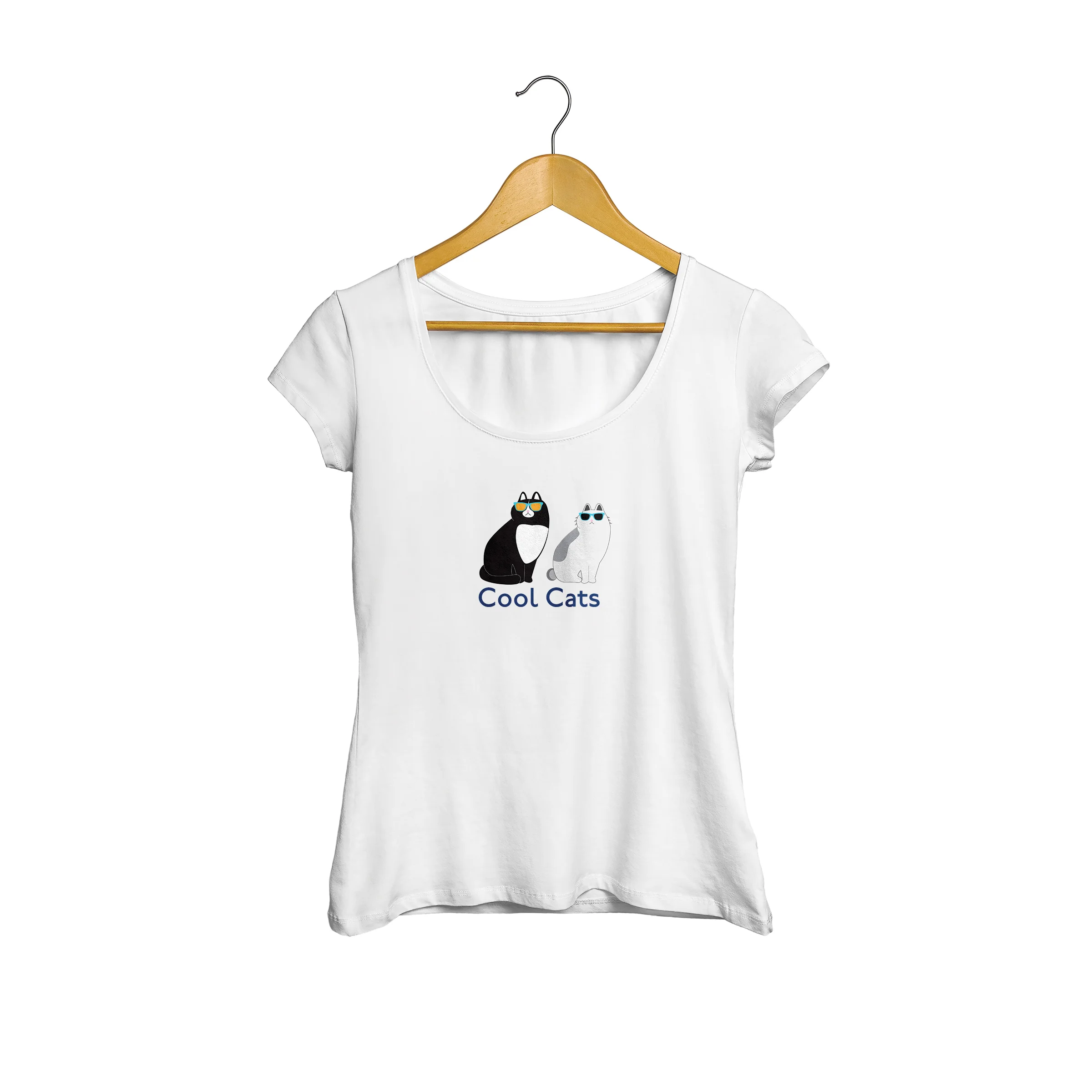
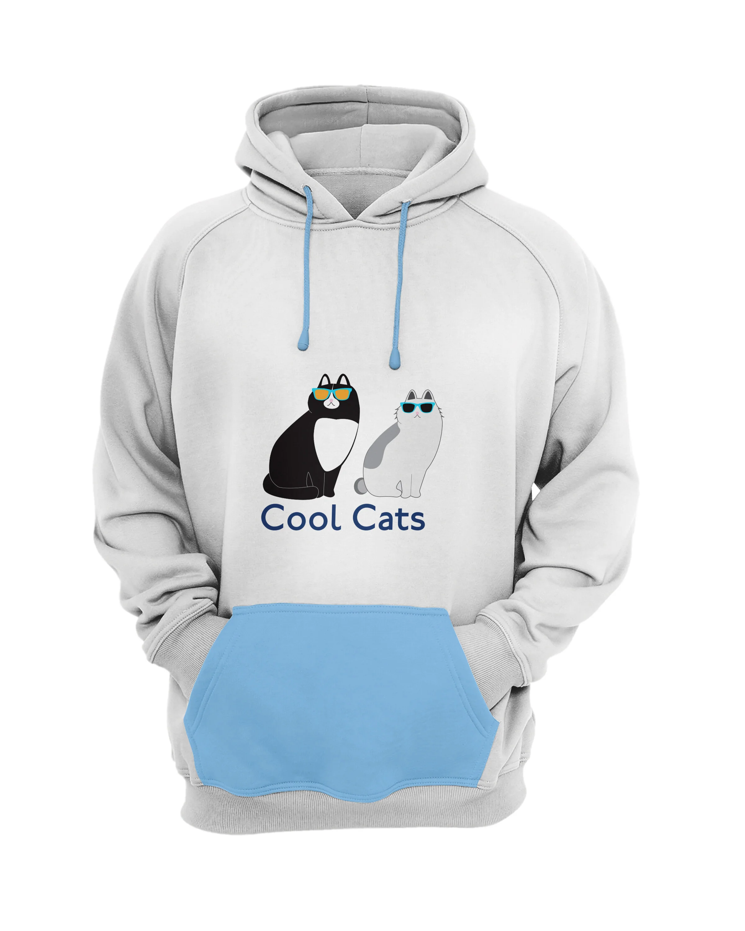
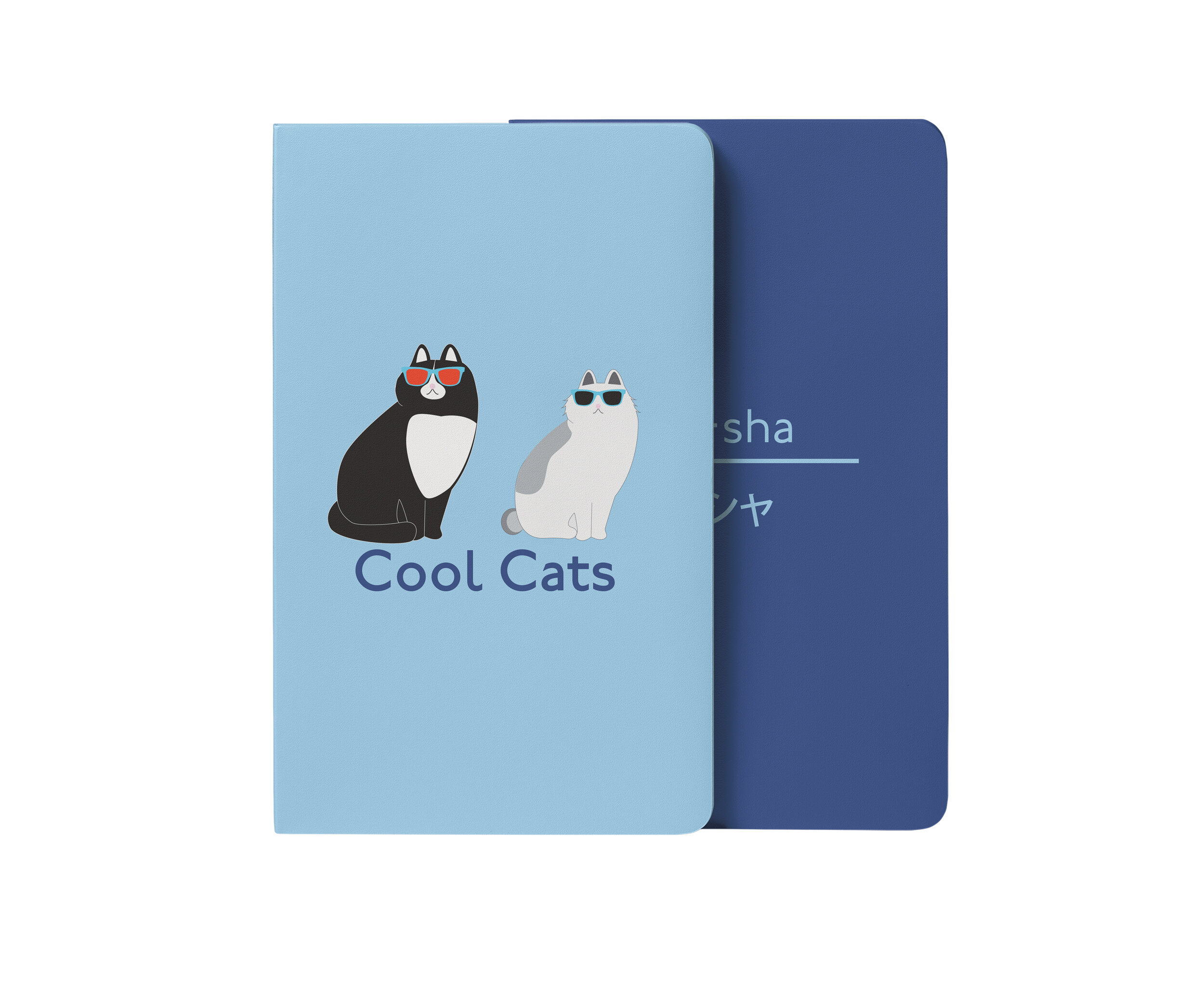
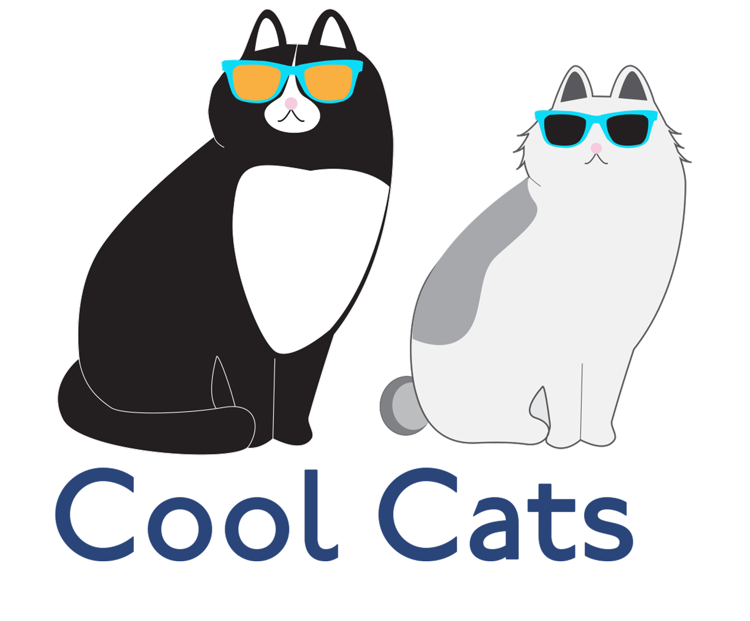
Misha’s identity is fun, whimsical, and cute. The identity of the campaign includes bright colors, a whimsical style of type, and a logo combination that includes a Japanese sub-head—because Misha is a Japanese Bobtail.
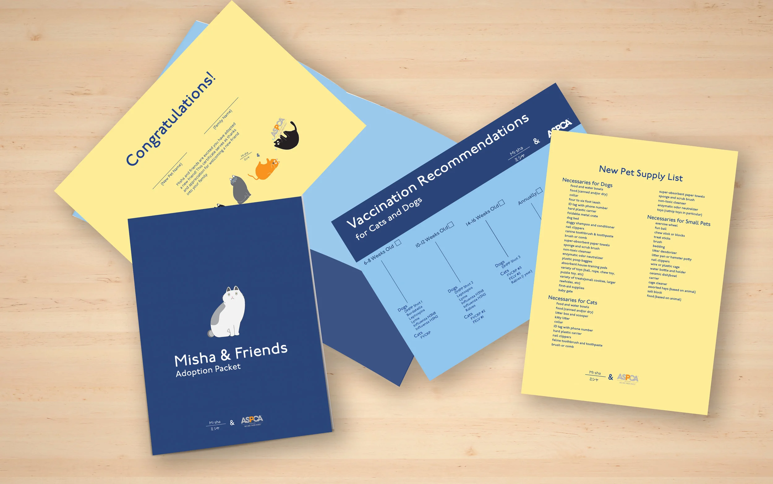
Often animals are abandoned, abused, and even when they are saved cannot be adopted. The Misha campaign faces this problem by getting people out into shelters to adopt and gives them a fun and interactive packet to help them when they do adopt a new friend.
The solution is a light hearted packet of information meant to not only educate the adopter about adopting, but also a street poster piece to spread awareness for people to adopt. It shows a light side to a serious issue, and is competitive in terms of pulling on levity and not the downtrodden sadness of other adoption commercials and materials. Designed for millennial parents, this adoption kit turns the tables on traditional adopting methods. Misha also sports an entire line of shirts, stickers, hats, and a thank you card for adopters. The brand also features some of her friends, that are shown throughout the adoption packet and promotional materials.
The U.S. Navy is all about heritage, strength, and drive. With 242 years of history behind it, the identity is defined by it’s distinctive colors and individual pride. The U.S. Navy has the most diverse set of programs within the U.S. military,including air, sea, and special forces.
The United States Navy does not have the same kind of recruiting materials as the U.S. Army or the Marines. Their materials are outdated and not as relevant as other branches of the service. The Navy is looking to add more sailors. There is a push to get more recruits through the door and into the service, making this campaign crucial to boost the Navy’s recruiting numbers.
The solution contains a poster campaign showcasing the Navy lifestyle as well as the reasons to join: adventure, pride, and opportunity. The brochure focuses on six major categories important to recruits ages 18-24. The highlights are travel and education spread through a dynamic layout. The posters are designed to become a part of the environment and get this group thinking about joining the service. The website is designed to reiterate some of the brochure information in a digital format. By creating navyrecruiting.cs, recruits have an easy way to access information pertaining purely to what they need.
Connect Jax has it’s roots in the identity of Jacksonville. Jacksonville is a trendy, modern, fun loving city full of commuters looking for a fast, easy way to not only get to work, but just get around Jacksonville for events.
Getting around Jacksonville is challenging. With clogged interstates, heavy traffic, and accidents the need for a more effective transportation system is imperative. The problem of how to communicate that system in a way that is both fun and effective was the issue for Connect Jax.
The Connect Jax system not only solves some of the real and challenging traffic problems within Jacksonville, but it also promotes the brand in a fun and effective way. The color scheme is designed to be trendy but also fun and whimsical. The transportation line is designed to connect into every neighborhood in Jacksonville. It also connects our United States Navy population, one of the larger populations in Jacksonville. This system speaks to the identity of Jacksonville through it’s marketing materials, calling to the very heart of Jacksonville sports and entertainment.